Our target users were newly hired UX designers. We were able to interview 4 people for the design sprint, asked them about their onboarding experience, and compiled notes with their comments that we then consolidated into a few main topics.
An updated onboarding experience for remote hires
Internship project · 1 week intensive
Overview
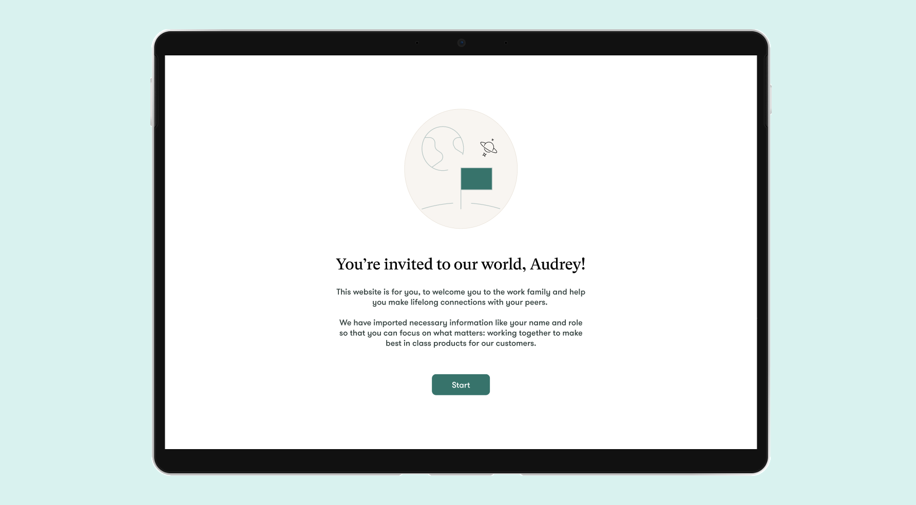
For new hires at a financial company, remote onboarding was a challenge. What kind of platform would best meet their needs?
Background
During my product design internship at a financial company, my fellow interns and I participated in a week-long design sprint. We had to design a platform for new hires to onboard remotely, since the company didn't have a formal process for that in place.
My role
I participated in research, interviews, analysis and ideation sessions. While we all collaborated, another intern and I were responsible for building the onboarding and individual employee pages.
Table of Contents
01. Research + Analysis
User interviews
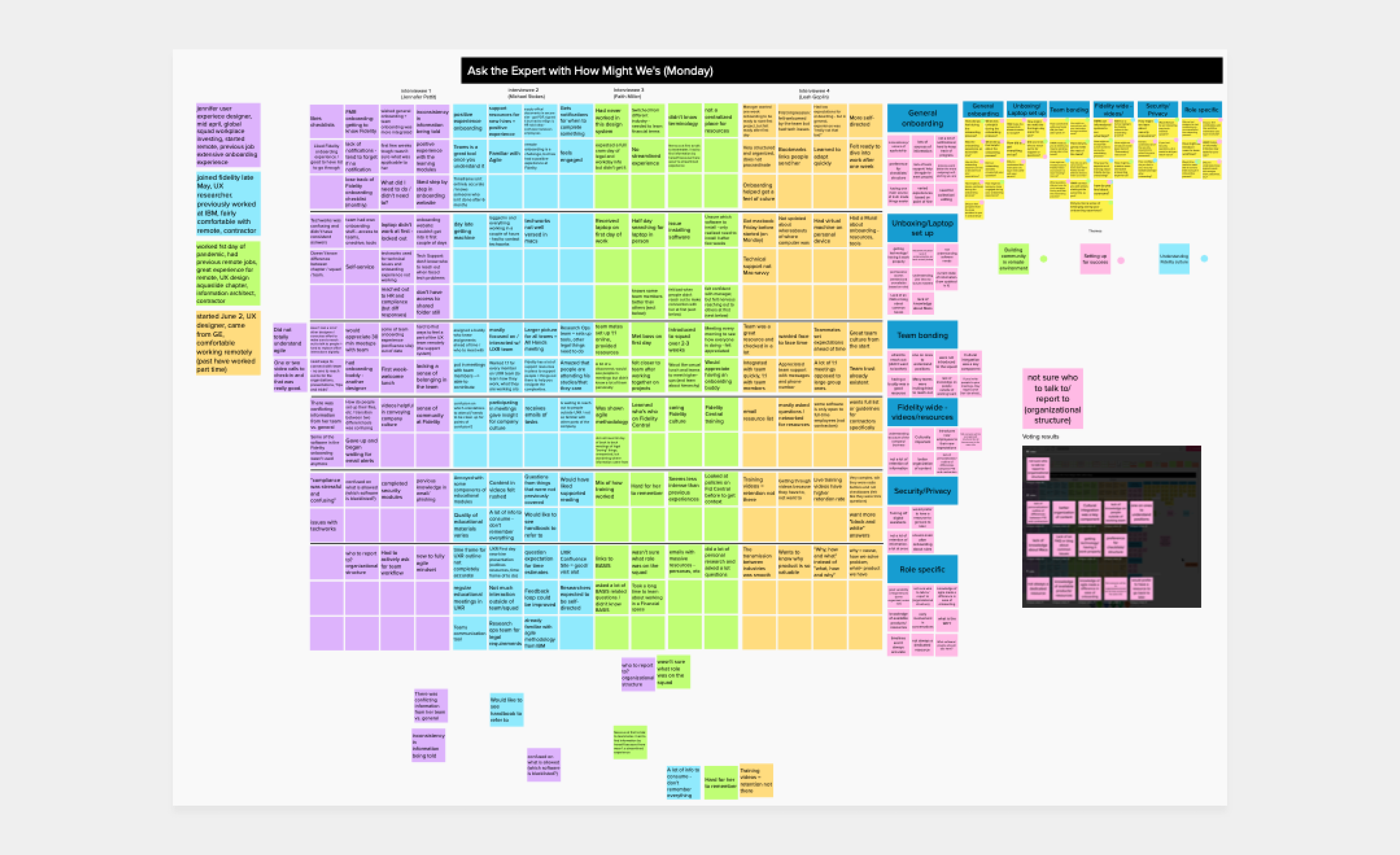
Interview results
Unclear structure
2/4 felt the team's organizational structure was unclear
No formal process
3/4 struggled feeling they'd met enough coworkers or onboarded thoroughly
Inconsistent info
4/4 felt that onboarding information was inconsistent and/or outdated
Some competitor research
Wanting to learn more about onboarding, we found articles discussing what onboarding processes and strategies result in highest employee retention. We grouped them into different buckets that could act as a reference for our designs.
Digestible information
Visual learning
Progress tracking
Central source of truth
Humor & celebration
Gamification & rewards
02. Defining goals
New hires felt disoriented without a formal process, and disconnected from their organization. What did an onboarding platform need to do to correct these problems?
Provide an overview
- Understand the company's organizational structure and someone's place in it
Enable connection
- A better system to learn what coworkers focus on and connect with people
Centralize information
- An easily maintained source of truth for onboarding information and progress tracking
03. Ideation
Brainstorming concepts
To brainstorm solutions, we followed four rounds of ideation. We first wrote out design ideas, did a crazy 8's exercise, voted anonymously on each other's ideas and then committed to a final design to build out.
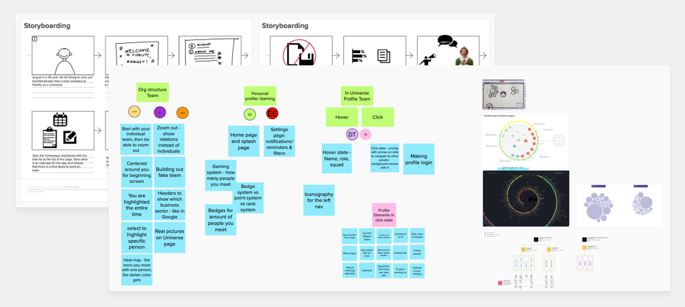
Because of interviewees’ concerns with understanding the company’s organizational structure and opportunities for getting to know colleagues and socializing, we decided to focus on the idea of the “universe,” which would visualize the new hire’s unique position in the company and introduce them to their colleagues.
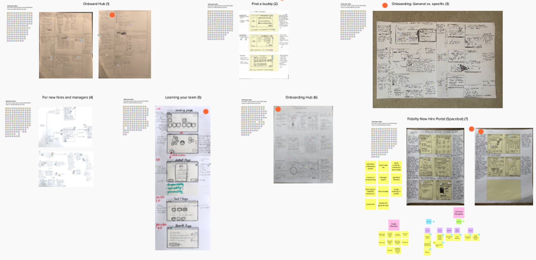
Defining the concept + Storyboarding
By the end of the four rounds, we voted on an onboarding hub that would act as a single source of truth, and have the following features:
A centralized location to view and complete all onboarding tasks.
A holistic, non-hierarchical view of the company structure (it was important to the team that new employees felt that they were part of the group rather than being 'at the bottom' of a pyramid).
Employee profiles that provided information on each person's past and present teams, as well as an opportunity to connect with them.
04. First prototype
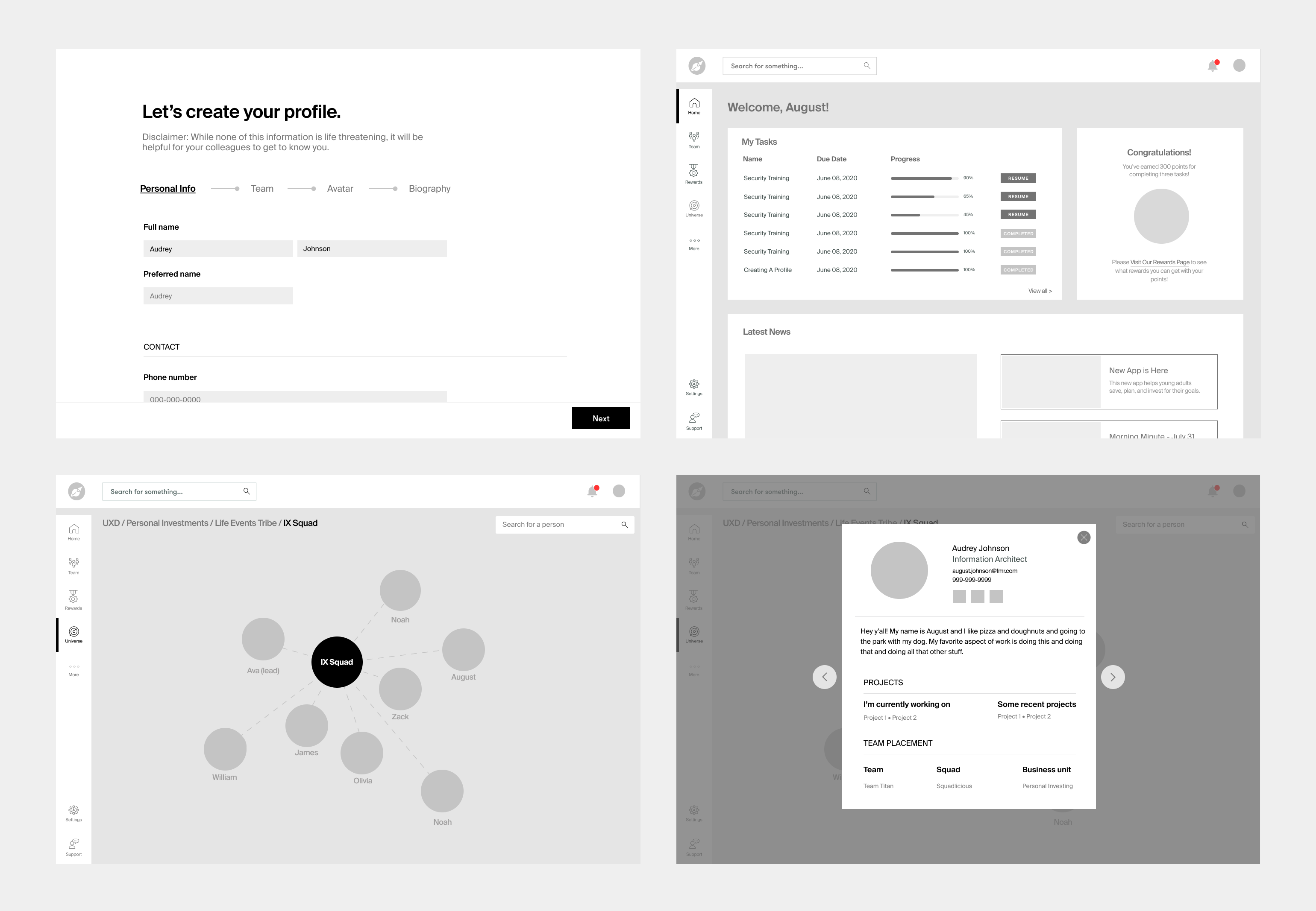
In the next days, we completed a first pass at the onboarding hub. It proposed a single "source of truth" with a task tracker, rewards and a social area where people could see where they fell in the company structure.
05. Testing + Feedback
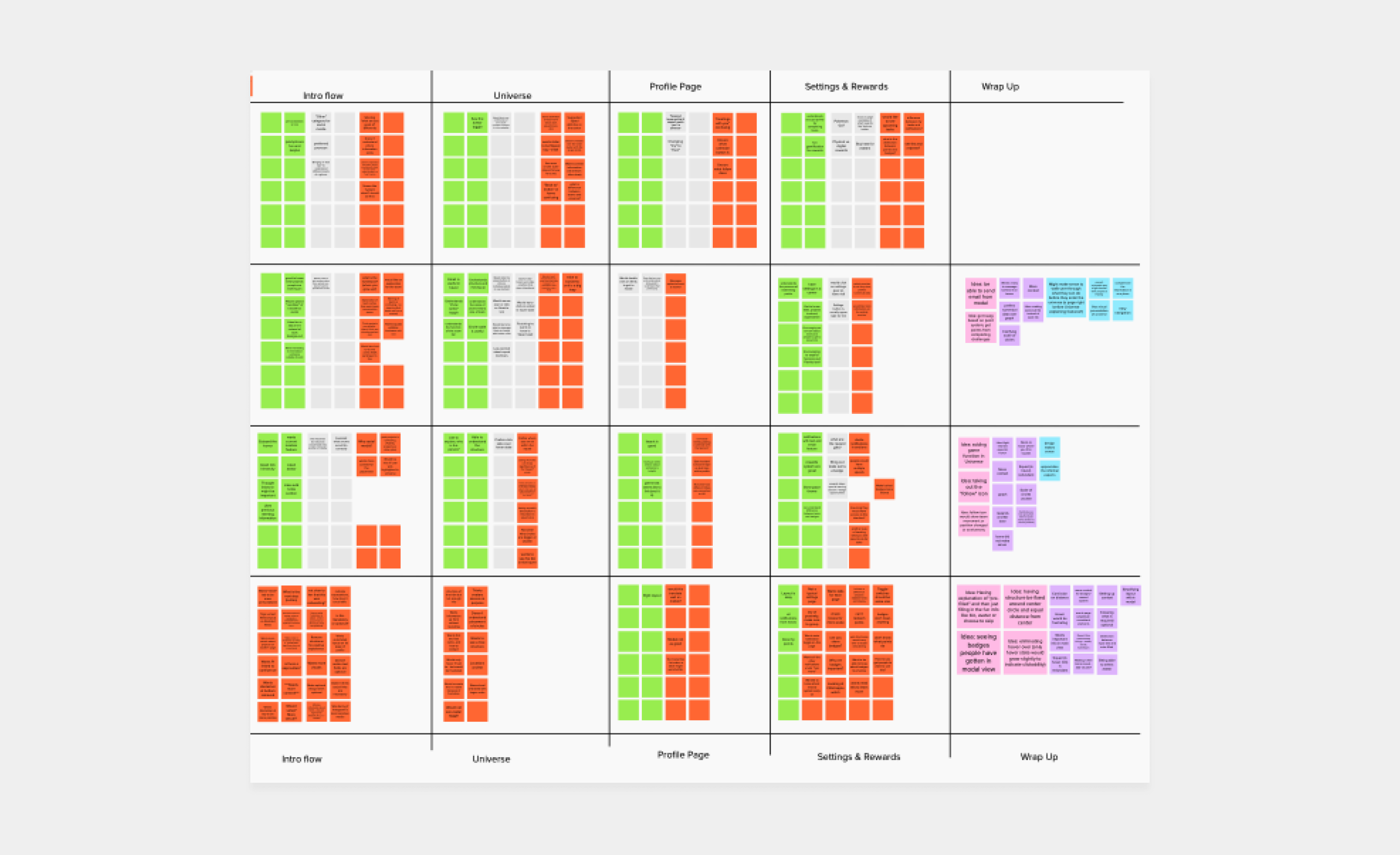
We tested the concept with our original interviewees, and wrote down their responses and reactions.
What worked
Company structure: Users really liked being able to see the teams and people that made up the org chart.
Single source of truth: Testers responded positively to having all their information in one place.
Rewards: People liked gamification and having the opportunity to earn rewards.
What didn't
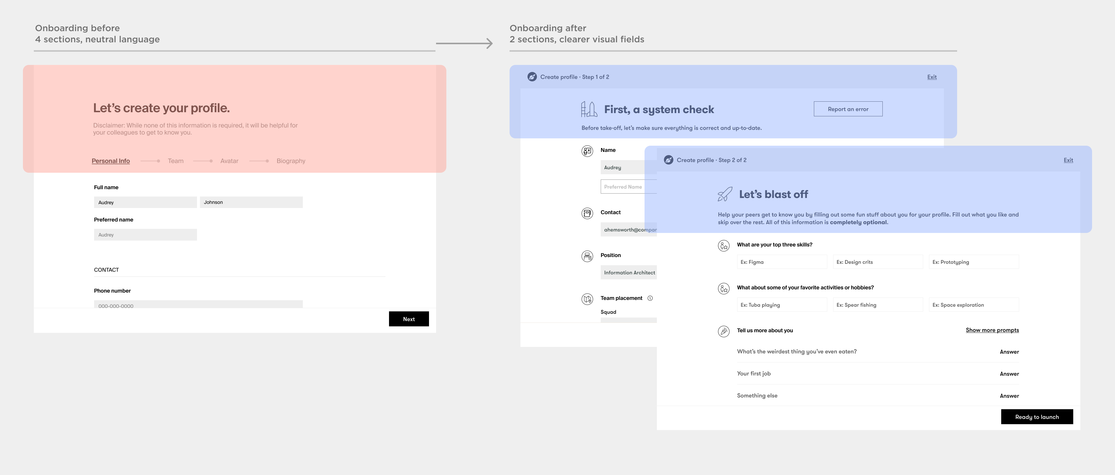
Onboarding: The profile's fields were somewhat confusing and testers felt it had too many sections.
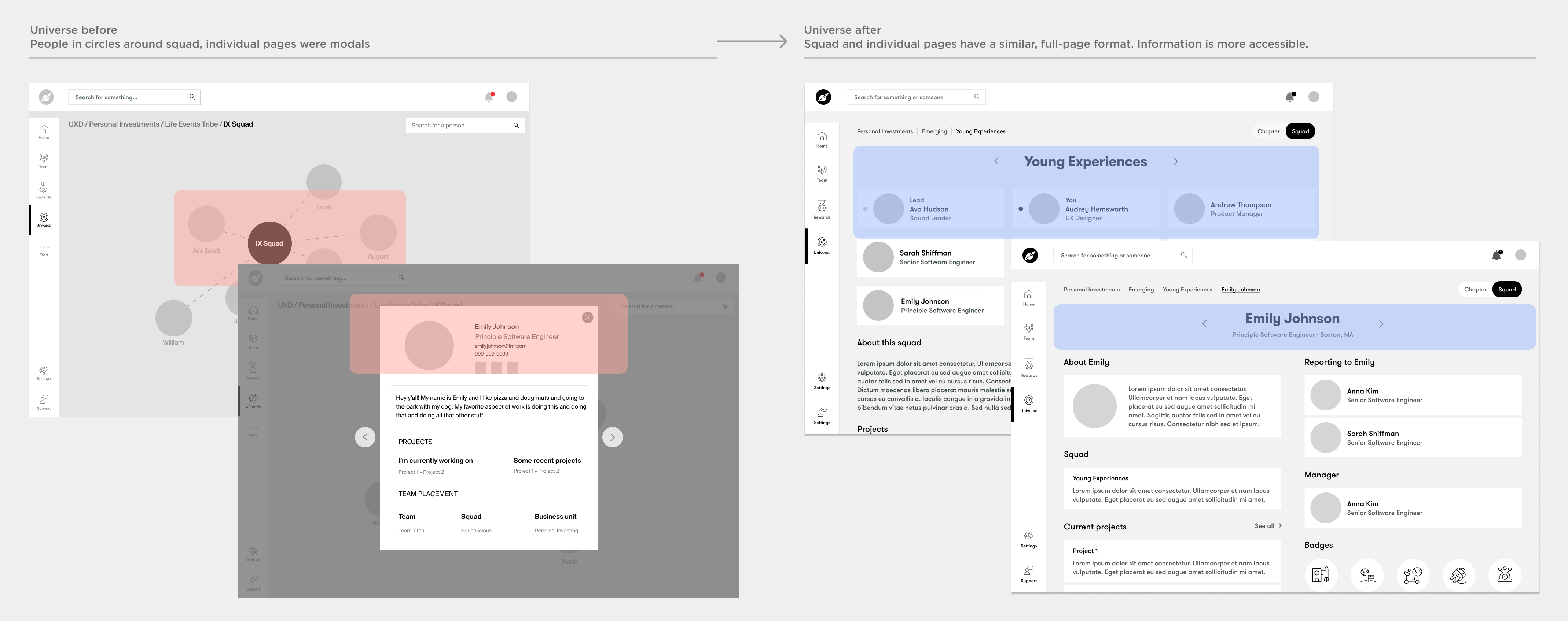
Information display: Users found the 'universe' view confusing.
Profile: People wanted to see more information about their coworkers.
Responding to feedback
In our second iteration, we made the onboarding reflect the "space" theme of the platform and reduced the # of steps from 4 to 2. We moved away from the literal "universe" concept to make a more responsive design, which also enabled better scanning and surfaced more relevant information.
06. Design
Final design features
01. Getting up to speed
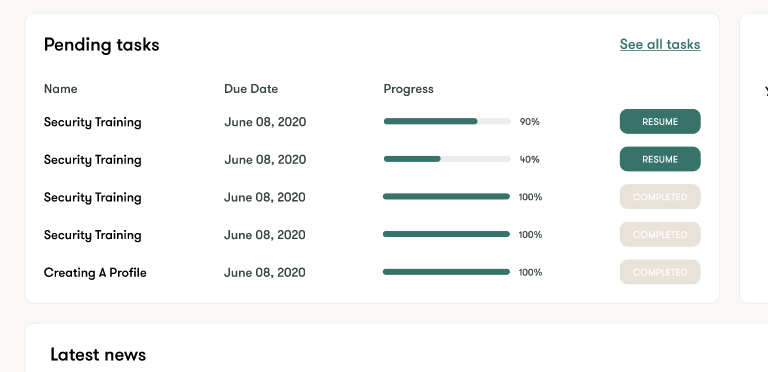
A consolidated task manager provides a clear path to onboarding, and news help stay informed about current company events
02. Have fun unlocking rewards
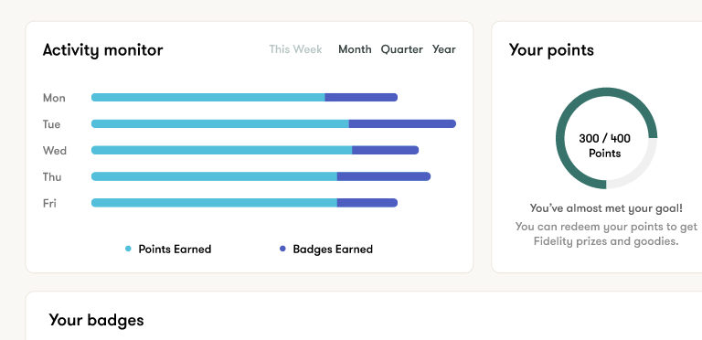
Users have the opportunity to unlock badges for work performance and task completion, earn points, see their progress and get rewards.
03. Understand the company structure
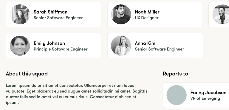
Users can the composition of their and other people squads, understand where every team and person falls in the company structure, and who each reports to.
04. Learn who is working on what
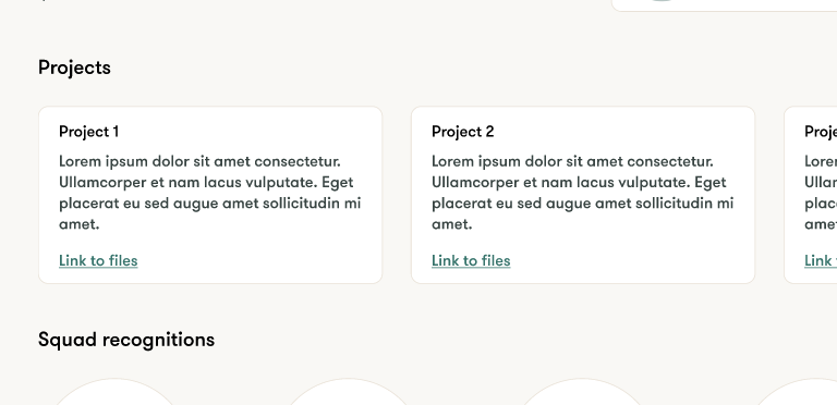
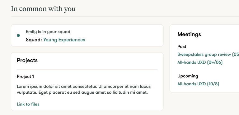
People wanted to know other team and people's work and how they were related. Here you can see what projects everyone is working on and their files, so you have easy access to important information.
05. Connect with coworkers
Employees can read coworkers' bios, learn what they've worked on previously, and their common meetings and projects.
Stakeholder reactions
We gave the final presentation to about 50 UX designers of varying levels, and they responded very positively to the concept and its execution. Many said that this would be a very useful tool for their day to days.
Takeaways
It was interesting to work with a team on a quick ideation process, since we were responding very rapidly to information gathered from a few interviews and working with little data. At the same time, the concept we came up with resonated with our users, and we ended up addressing a problem that's not just an onboarding issue—the difficulty that teams have communicating in large organizations.